#7230 closed enhancement (fixed)
Visually improve the search dialog
| Reported by: | simon04 | Owned by: | team |
|---|---|---|---|
| Priority: | normal | Milestone: | |
| Component: | Core | Version: | |
| Keywords: | search | Cc: | joshdoe |
Description
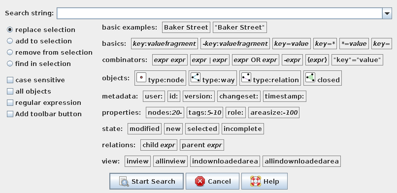
As the list of possible search key words steadily increases, the search dialog gets longer and less clear.
Some ideas how to improve on that:
- Often, the keywords are self-explanatory. Thus, move the description to a tooltip.
- Keywords need to be copied from the label to the search field. Thus, insert the keyword on click.
- Some keywords logically belong together. Thus, show them in a group (e.g., by same color).
- Often, examples are easier to understand than abstract definitions. Thus, show a usage example (e.g., for
child/parent). Colour the example part of a keyword differently. - For some keywords, one can find icons to illustrate their meaning.
This screenshot is from a test implementation. I'm definitively no expert in the GridBagLayout ;-) (I'd like all boxes to move to the left as far as possible without this grid-like look). I'll attach the code for completeness (and not to lose it). Clearly, it needs several improvements.
What do you think?
Attachments (6)
Change History (31)
by , 13 years ago
| Attachment: | search.png added |
|---|
by , 13 years ago
| Attachment: | 7230_alpha.patch added |
|---|
comment:1 by , 13 years ago
by , 13 years ago
| Attachment: | 7230_beta.patch added |
|---|
by , 13 years ago
| Attachment: | search2.png added |
|---|
follow-up: 10 comment:2 by , 13 years ago
comment:3 by , 13 years ago
| Summary: | [dirty patch as proof of concept] Visually improve the search dialog → [patch] Visually improve the search dialog |
|---|
follow-up: 5 comment:4 by , 13 years ago
I do not yet know if I like it, but the patch drops all I18N comments and that I do not like.
follow-up: 6 comment:5 by , 13 years ago
Replying to stoecker:
I do not yet know if I like it, but the patch drops all I18N comments and that I do not like.
The i18n comments are no longer needed, as only the description (i.e., tooltip) but not the displayed keywords are translated.
follow-up: 7 comment:6 by , 13 years ago
Replying to simon04:
The i18n comments are no longer needed, as only the description (i.e., tooltip) but not the displayed keywords are translated.
This is true for a lot of texts, but there are also text which include keywords (i.e. timestamp:), which must not be translated.
comment:7 by , 13 years ago
Replying to stoecker:
This is true for a lot of texts, but there are also text which include keywords (i.e. timestamp:), which must not be translated.
.addKeyword("timestamp:", "timestamp:", tr("objects with last modification timestamp within range", "timestamp:2012/", "timestamp:2008/2011-02-04T12"))
I got the parentheses wrong, the last two strings are usage examples …
comment:8 by , 13 years ago
Another note:
The line .addKeyword("<img src=\"http://josm.openstreetmap.de/export/4326/josm/trunk/images/Mf_node.png\"> is broken. We don't want to reference external resources inside of the software.
comment:9 by , 13 years ago
Verbose tooltipls would be good, like "when value of tag key does not contain valuefragment" on "-key:valuefragment", elsewhere those who use it first time can be still confused :)
follow-up: 11 comment:10 by , 13 years ago
| Cc: | added |
|---|
Replying to simon04:
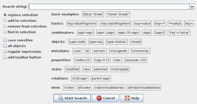
A more serious implementation … :-) In the non-expert mode, only the first three rows are shown.
I like this one better, but I'd have to think more about it.
Do consider how we might show search operators which might be registered by plugins, which is something I'm working on now:
#7178 Allow plugins to register search operators
Right now I was thinking that each search operator should provide the keyword and description to be shown in the dialog, but perhaps it should be a short tooltip and a longer description. As for how it would be shown in the dialog, perhaps an additional row at the bottom for plugin search keywords.
comment:11 by , 13 years ago
Replying to stoecker:
The line .addKeyword("<img src=\"http://josm.openstreetmap.de/export/4326/josm/trunk/images/Mf_node.png\"> is broken. We don't want to reference external resources inside of the software.
Is there a good way to include images into html panels?
Replying to joshdoe:
Right now I was thinking that each search operator should provide the keyword and description to be shown in the dialog, but perhaps it should be a short tooltip and a longer description. As for how it would be shown in the dialog, perhaps an additional row at the bottom for plugin search keywords.
For this dialog, I'm using a displayed text, a text to be inserted when clicking the box, a tooltip text, as well as a list of usage examples. It would be helpful if you included them to your rework of the search compiler. :-)
follow-up: 13 comment:12 by , 13 years ago
Can we modify this in a way, that old a new form only depend on the hidden setting? This would allow to have a smooth testing period.
by , 13 years ago
| Attachment: | 7230_gamma.patch added |
|---|
follow-up: 18 comment:13 by , 13 years ago
Replying to stoecker:
Can we modify this in a way, that old a new form only depend on the hidden setting? This would allow to have a smooth testing period.
Done. New search hints can be enabled by setting dialog.search.new to true.
To dynamically fill the hints from the MatchFactory's, all subclasses would need to implement a few methods, like String getHint(), Collection<String> getUsageExamples(), String getCategory().
comment:14 by , 13 years ago
Please no "import javax.swing.*;", the individual files are better.
We go into stabilization next week (no text changes anymore). If this is stable enough for beta testing and the unmodified display is still valid, then it should be added until sunday.
comment:15 by , 13 years ago
Regarding the icon in HTML: Have a look at http://docs.oracle.com/javase/tutorial/uiswing/components/editorpane.html. It seems you need to set the icon as attribute to the document of the display. The "Mf_" icons are already part of JOSM BTW.
comment:17 by , 13 years ago
| Summary: | [patch] Visually improve the search dialog → Visually improve the search dialog |
|---|
follow-ups: 19 21 comment:18 by , 13 years ago
Replying to simon04:
Replying to stoecker:
Can we modify this in a way, that old a new form only depend on the hidden setting? This would allow to have a smooth testing period.
Done. New search hints can be enabled by setting
dialog.search.newtotrue.
I generally like this, though the category labels need to be better differentiated from the rest, perhaps by adding capitalization and using a bold font. I think I like the boxes around the entries as in a previous image, as it prevents them from running together, and is also a visual hint that they can be clicked.
To dynamically fill the hints from the
MatchFactory's, all subclasses would need to implement a few methods, likeString getHint(),Collection<String> getUsageExamples(),String getCategory().
Looking at the current implementation, it would be more like String getDisplayText() and String getInsertText(), instead of just getHint(). Should plugins be able to add themselves to any category, or should we have just one category for plugin keywords? I can take care of adding these to MatchFactory if you want to adapt the dialog to accept these.
comment:19 by , 13 years ago
Replying to joshdoe:
I generally like this, though the category labels need to be better differentiated from the rest, perhaps by adding capitalization and using a bold font.
I'll experiment a bit …
Looking at the current implementation, it would be more like
String getDisplayText()andString getInsertText(), instead of justgetHint().
Probably all three. Concerning getHint(), I thought of the tooltip text/explanation.
Should plugins be able to add themselves to any category, or should we have just one category for plugin keywords?
I think it makes more sense to allow the plugin to category. If a plugin defined a XOR keyword, it best be listed in the category "combinators".
I can take care of adding these to
MatchFactoryif you want to adapt the dialog to accept these.
I appreciate your help. :-) Probably we should await some feedback to know whether the new design is appreciated at all …
comment:20 by , 13 years ago
Should we somehow announce the alternative search dialog, e.g., in startup news?
comment:21 by , 13 years ago
Replying to joshdoe:
Replying to simon04:
Replying to stoecker:
Can we modify this in a way, that old a new form only depend on the hidden setting? This would allow to have a smooth testing period.
Done. New search hints can be enabled by setting
dialog.search.newtotrue.
I generally like this, though the category labels need to be better differentiated from the rest, perhaps by adding capitalization and using a bold font. I think I like the boxes around the entries as in a previous image, as it prevents them from running together, and is also a visual hint that they can be clicked.
+1
I also do not understand the sense of the first button Baker Street and think the second button "Baker Street" should only add "".
by , 13 years ago
| Attachment: | search3.png added |
|---|
comment:24 by , 11 years ago
| Resolution: | → fixed |
|---|---|
| Status: | new → closed |


I like it. If you don't want the grid-look, then put each line in an extra panel (or use another layout manager).
Don't hesitate to put
<html>in the tooltip text and use multiple lines for long descriptions and examples.