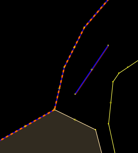
advanced coastline mappaint style
I was thinking about displaying the sides of a coastline in the mapview because errors in the coastline can cause big rendering issues. (We also have such renderings for cliff, embankment, kerb, retaining_wall.) Possible solutions could be:
- blue right-casing and brown left casing
- image pattern with waves at the right side
However we already have validator warnings for coastlines and I do not know if an advanced paint style would be distracting. Coastlines are also often together with boundaries and landuse borders. Since I do not have experience with coastline mapping, I'm not sure if it would be helpful or painful. Any opinions?
Example:

Code for this:
way[natural=coastline] {
    width: 1;
    color: water#0000ff;
    right-casing-width: 2;
    right-casing-color: water#0000ff;
    right-casing-offset: -1;
    left-casing-width: 2;
    left-casing-color: brown;
    left-casing-offset: -1;
}
Change History
(9)
| Description: |
modified (diff)
|
| Description: |
modified (diff)
|
| Resolution: |
→ fixed
|
| Status: |
new → closed
|


It is a good idea to have a visual cue what direction the coastline should be. I fear with both a brown and a blue line, it looks as if there are 2 ways. Maybe we can imitate the Mapnik style for nature_reserve (e.g. here).
(Not sure if this style is intuitive though.)