Opened 11 years ago
Closed 11 years ago
#10301 closed enhancement (fixed)
extend display of maxspeed nodes [patch]
| Reported by: | Klumbumbus | Owned by: | bastiK |
|---|---|---|---|
| Priority: | normal | Milestone: | 14.08 |
| Component: | Internal mappaint style | Version: | |
| Keywords: | maxspeed | Cc: |
Description (last modified by )
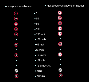
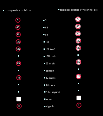
Currently every node with maxspeed=* shows a maxspeed icon with a maxspeed of 60, which is far from optimal.
This patch changes it, so it shows the actual value.
- The value is shown if the value of maxspeed is
- only a number
- a number followed by a whitespace and followed by
- km/h
- mph
- knots
- If maxspeed=none a new icon
is shown
- If maxspeed:variable is set or maxspeed=signals, the sign turns into black backgrund with white text, which then looks like a common LED sign.
- If maxspeed=signals a sign is shown which looks like the LED pixel matrix of such a sign
All other cases should be tagging errors, therefore no sign is displayed.
Attachments (21)
Change History (52)
by , 11 years ago
| Attachment: | maxspeed_none.svg added |
|---|
by , 11 years ago
| Attachment: | maxspeednodes.png added |
|---|
comment:1 by , 11 years ago
| Description: | modified (diff) |
|---|
by , 11 years ago
| Attachment: | maxspeednodes.diff added |
|---|
comment:2 by , 11 years ago
| Description: | modified (diff) |
|---|
comment:3 by , 11 years ago
| Milestone: | → 14.07 |
|---|
comment:4 by , 11 years ago
| Owner: | changed from to |
|---|---|
| Status: | new → assigned |
Nice! I'll check it in soon.
by , 11 years ago
| Attachment: | trafficsigns-linux.png added |
|---|
by , 11 years ago
| Attachment: | maxspeednodesexample.osm added |
|---|
comment:6 by , 11 years ago
My system is Windows 7. Does linux use other fonts/font families in JOSM?
comment:7 by , 11 years ago
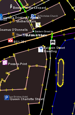
On Linux (Ubuntu) it looks a little strange:

The reason is that there are different default fonts in different operating systems:
- Win: Arial
- Linux: Dejavu (haven't checked all distributions, but I would guess it is the same)
- Apple: ?
Possible solutions:
- Abandon the patch and add one image and one rule for each number that can be found on a restriction sign. This would be simple and we'd get a consistent look. However this approach does not work for the planned rendering of house number plates, highway shields and similar advanced techniques.
- Platform / font dependent tweaks in the style sheet. (ugly, hard to maintain)
- Ship a common opensource font inside the binary .jar
- This would guarantee consistent look for all fancy geometric construction that involve font.
- Increased download size probably in the order of ~100-200 kB.
- May improve quality of text rendering in general.
comment:8 by , 11 years ago
I there a font which is shiped with all (or the most) operating systems? So we could specify this in the mappaint font-family: "xyz";
comment:9 by , 11 years ago
I don't think so. Lucida is shipped with Oracle JRE but not with OpenJDK. All the pre-installed fonts in Win XP seem to be proprietary, so none of these will be available in Linux.
comment:10 by , 11 years ago
Yes and no.
See http://docs.oracle.com/javase/7/docs/api/java/awt/Font.html
The Java Platform distinguishes between two kinds of fonts: physical fonts and logical fonts.
Physical fonts are the actual font libraries containing glyph data and tables to map from character sequences to glyph sequences, using a font technology such as TrueType or PostScript Type 1. All implementations of the Java Platform must support TrueType fonts; support for other font technologies is implementation dependent. Physical fonts may use names such as Helvetica, Palatino, HonMincho, or any number of other font names. Typically, each physical font supports only a limited set of writing systems, for example, only Latin characters or only Japanese and Basic Latin. The set of available physical fonts varies between configurations. Applications that require specific fonts can bundle them and instantiate them using the createFont method.
Logical fonts are the five font families defined by the Java platform which must be supported by any Java runtime environment: Serif, SansSerif, Monospaced, Dialog, and DialogInput. These logical fonts are not actual font libraries. Instead, the logical font names are mapped to physical fonts by the Java runtime environment. The mapping is implementation and usually locale dependent, so the look and the metrics provided by them vary. Typically, each logical font name maps to several physical fonts in order to cover a large range of characters.
Can both of you try playing with font families "Serif, SansSerif, Monospaced, Dialog, and DialogInput" ?
Maybe we can find one that behaves in the same way on Windows and Ubuntu.
comment:11 by , 11 years ago
According to fontconfig.properties:
Linux:
serif = DejaVu Serif
sansserif = DejaVu Sans
monospaced = DejaVu Sans Mono
Win:
serif = Times New Roman
sansserif = Arial
monospaced = Courier New
On both systems, dialog is an alias for sansserif and dialoginput is an alias for monospaced.
by , 11 years ago
| Attachment: | Liberation Sans.png added |
|---|
follow-up: 14 comment:12 by , 11 years ago
DejaVu Serif
DejaVu Sans
DejaVu Sans Mono
Times New Roman
Arial
Courier New
I tried all of these. For the maxspeed signs only Arial looks good. All others are to wide compared to their height, so they don't fit in the circle. I don't want to make the circle bigger, because it would be bigger than other icons then.
What about Libaration Sans? Seems it's open license.
Modification to:
    font-family: "Liberation Sans";
    text-offset-y: -1;
comment:13 by , 11 years ago
Another thing to consider:
JOSM warns about maxspeed on nodes, because maxspeed is better on ways. However some tag the signs itself beside the street so it is easier to create maxspeed:forward and maxspeed:backward on the way. Another valid case I think is if the maxspeed node is part of a oneway (e.g. on motorways) and indicates the sign and beginning of the maxspeed restriction. Maxspeed is used 29000 times on nodes. So I think it is ok, to display maxspeed on nodes in general, or should we drop it at all?
follow-ups: 15 21 comment:14 by , 11 years ago
Replying to Klumbumbus:
What about Libaration Sans? Seems it's open license.
Looks good, but not compatible to GPL v3.
by , 11 years ago
| Attachment: | arial-8.png added |
|---|
follow-up: 18 comment:15 by , 11 years ago
by , 11 years ago
| Attachment: | arial-10.png added |
|---|
by , 11 years ago
| Attachment: | arial-12.png added |
|---|
by , 11 years ago
| Attachment: | dejavu-8.png added |
|---|
by , 11 years ago
| Attachment: | dejavu-10.png added |
|---|
by , 11 years ago
| Attachment: | dejavu-12.png added |
|---|
by , 11 years ago
| Attachment: | lucida-sans-8.png added |
|---|
by , 11 years ago
| Attachment: | lucida-sans-10.png added |
|---|
by , 11 years ago
| Attachment: | lucida-sans-12.png added |
|---|
by , 11 years ago
| Attachment: | droid-sans-8.png added |
|---|
by , 11 years ago
| Attachment: | droid-sans-10.png added |
|---|
by , 11 years ago
| Attachment: | droid-sans-12.png added |
|---|
by , 11 years ago
| Attachment: | Droid Sans maxspeed.png added |
|---|
comment:16 by , 11 years ago
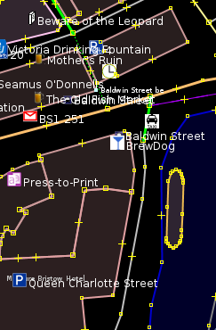
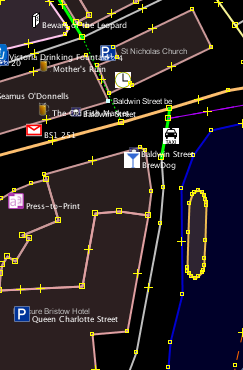
Sorry to digress a little, but I compared the general text rendering and it looks quite different if you compare Windows and Linux. We use font-size 8 at the moment. Arial looks pretty faint and blurry, compared to Dejavu which is clearer, but a little flashy. I added font size 10 and 12 for comparison. We could switch to larger font sizes at high zoom level.
As mentioned, Lucida is always available for Oracle JRE. I added the free font Droid (former Android font) for comparison. If we want to ship a font to unify the rendering, this would be a candidate.
(a) Arial
(b) Dejavu sans
(c) Lucida sans
(d) Droid sans
comment:17 by , 11 years ago
comment:18 by , 11 years ago
Replying to Don-vip:
Replying to bastiK:
Looks good, but not compatible to GPL v3.
Why?
The font itself cannot be re-licensed as GPL v3. (See e.g. https://github.com/FortAwesome/Font-Awesome/issues/1124)
This is a similar problem as with images. In this case one could really argue that the font is not an essential part of the program, but is a separate work that is distributed along JOSM as an aggregate (can be replaced by a different font at any time). Therefore I think it might be no problem.
comment:19 by , 11 years ago
OK thanks for the licensing explanation. Damn, these licensing issues are really boring. Sometimes it amazes me we can't ship an open source image/font/whatever in an open source program because of all these numerous and incompatible licences...
+1 for inclusion of Droid font, it looks very nice.
by , 11 years ago
| Attachment: | maxspeednodes2.diff added |
|---|
comment:20 by , 11 years ago
I uploaded a new maxspeed nodes diff file. I changed the character for maxspeed signals and maxspeed signs do no longer conflict with other icons (e.g. highway=speed_camera). It is also already optimized for the Droid Sans font.
comment:21 by , 11 years ago
Replying to bastiK:
Replying to Klumbumbus:
What about Libaration Sans? Seems it's open license.
Looks good, but not compatible to GPL v3.
Found Linux Libertine which is licensed GPL v3, but license does not seem to be the problem.
follow-up: 23 comment:22 by , 11 years ago
#9357 is very similar "Adress icon displaying value of "addr:housenumber" rather than fixed 41."
Maybe it can be fixed by the same person with limited additional work?
comment:24 by , 11 years ago
| Milestone: | 14.07 → 14.08 |
|---|
by , 11 years ago
| Attachment: | zoom on maxspeed nodes.diff added |
|---|
comment:27 by , 11 years ago
This patch adds zoom level to maxspeed nodes.
zoom on maxspeed nodes.diff
comment:30 by , 11 years ago
| Resolution: | fixed |
|---|---|
| Status: | closed → reopened |
Unit test MapCSSWithExtendedTextDirectivesTest needs to be updated:
http://donvip.fr/jenkins/job/JOSM/lastCompletedBuild/testReport/








Great :)